What Is A Web Form?
A web form is an element of a website that allows users to fill in information for purposes such as sending a message or making an order. Usually, web forms include any of the following elements — text boxes, text areas, radio buttons, checkboxes, dropdown lists, hidden fields, file upload, and buttons.
In our years of experience with building websites at Oangle, we noticed that web forms tend to be outside the main flow of a website’s design, usually tucked away as a separate element or in a separate page. This led us to wonder if there were better ways to design web forms to make them more seamless and feel like a more inclusive part of a website’s design.
As we searched around and discussed between ourselves, we found a list of practices to implement in order to improve the overall experience of using web forms. Read on to learn more about how to design better web forms.
1. Keep your users informed
Keeping your users informed is crucial in providing an enjoyable website user experience. Thus, it is good practice to educate your users on anything they might want to know about filling in your web form. This can be done by including a short description of the form’s purpose or what their data will be used for. Many users are concerned about their privacy and personal information on the web, and rightly so. Providing your users with reasons will reassure them, create trust and prevent them from feeling frustrated.
2. Offer assistance
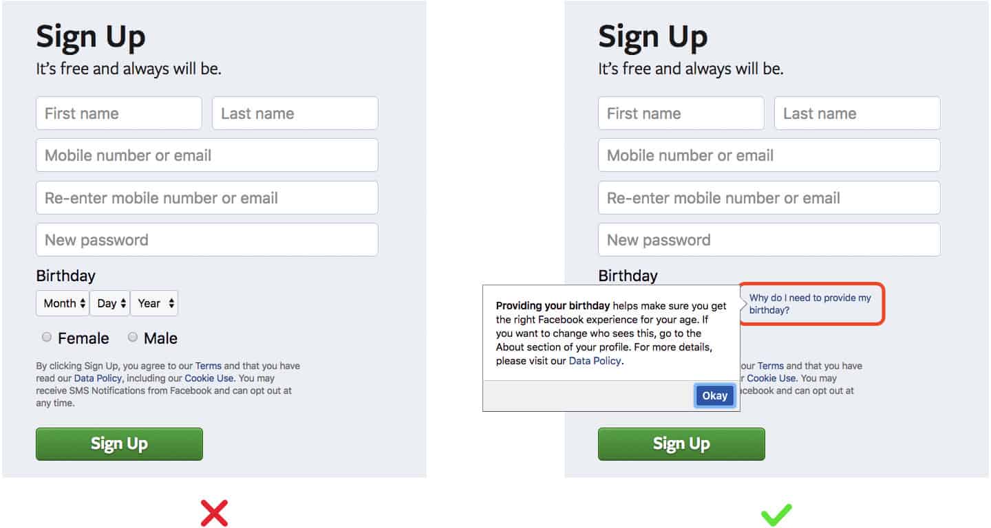
This is especially important for form fields that are uncommon. Not all of your visitors may be used to filling in web forms or understand what is required. To tackle this, add help text to offer instructions in a subtle and non-invasive way.
3. Make it simple
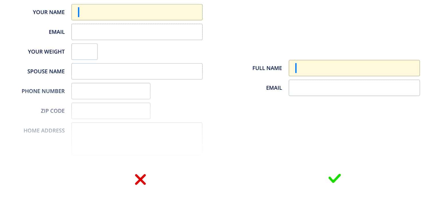
Research has proven that the more steps there are to a web form, the higher the dropout rate. As such, you should keep your web form as short and easy-to-use as possible. Only ask users for information that you really need.
On top of that, here are some pointers to make your form as clear and logical as possible:
- Order form fields logically and according to their importance
- Be clear about what you expect by providing examples (e.g. for email, [email protected]).
- Pre-fill likely default values such as location
- Allow toggling using the keyboard (e.g. using tab, shift + tab)
- Ensure your CTA is clear
4. Be clear with your error messages
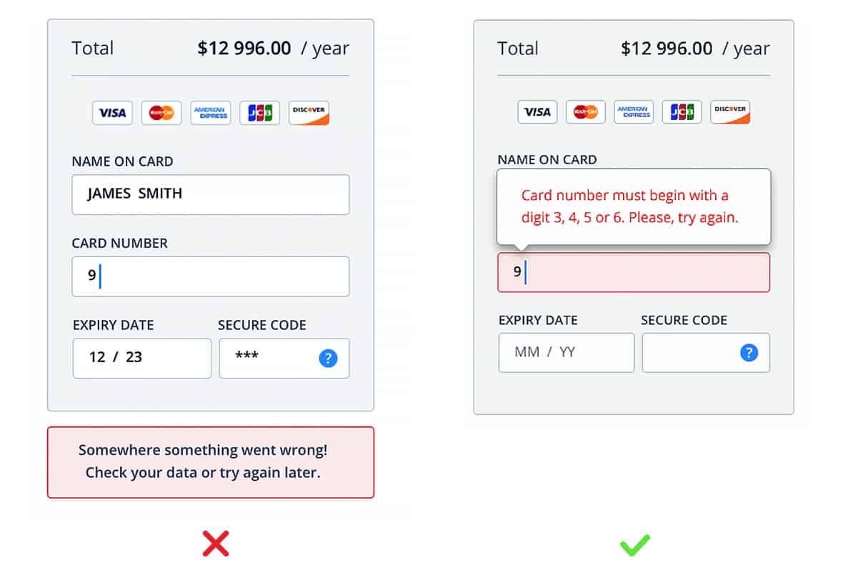
- Provide specific error messages
- Position and space your fields and error messages well so users can easily relate error messages to the respective fields
- Use real-time error messages to give feedback on the go and allow users to make instant corrections
- Do not clear correct inputs if there are errors in other fields
5. Provide clear feedback
- Indicate users’ progress using steps or a progress bar
- Highlight or indicate mandatory fields
- Use colours to guide users (e.g. red for errors and green for correct)
- Offer clear feedback once they successfully submit the form
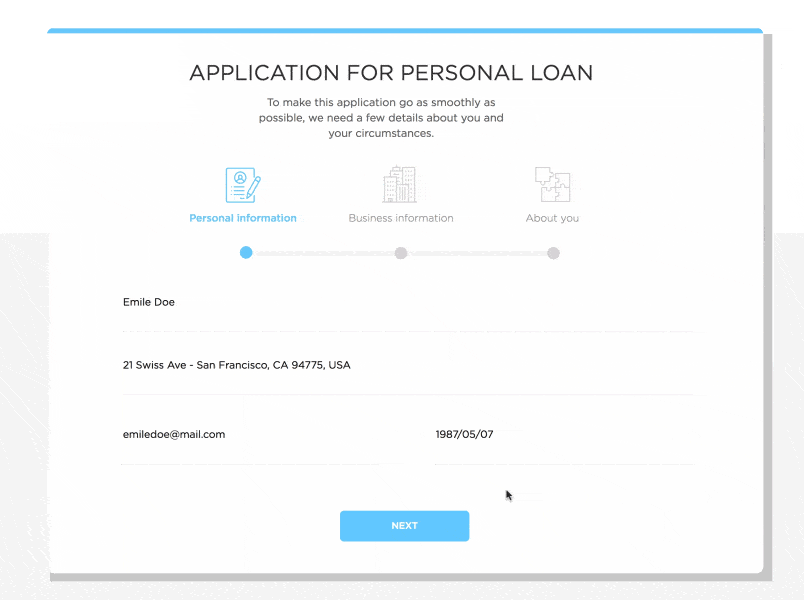
6. Segment your long forms clearly
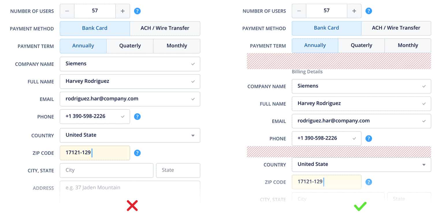
If your site requires a longer form, there are still ways to make it clearer and easier to use.
- Adopt a single column design
- Segment your form into different sections
- Use dynamic fields that show/hide based on prior selections
What Does The Future Of Web Forms Look Like?
As we researched how to improve the design of web forms, we thought about the future of web forms. Must web forms always be tucked in a separate page or break away from the standard design structure of a website design? Are there more seamless ways to include a web form in a web page without the form fields looking like form fields? We look forward to exploring these possibilities even as we continue to improve the UI and UX of our web forms.
There are many dos and don’ts to designing web forms, but it is always vital to keep your users in mind when designing. Keeping your forms simple and clear will be sure to provide a better user experience for your users. May the above points aid you in your future web form designs. As always, if you have any questions on designing web forms or any web-related issues in general, feel free to drop us a line. We’d be happy to help!