
As of November 2022, 49.78 percent of the total web visits are currently mobile, compared to 50.22 percent coming from desktops. Not only are mobiles portable smart devices you can whip out anytime anywhere, but it is also a great way to pass time during commute, a lunch buddy for single eaters or even a great distractor on the toilet. So, it is a no-brainer that more and more companies are catering to smartphones being used more frequently for online shopping, web browsing, online payment, government services sites, etc.
Why should we follow the Mobile Thumb Rule?
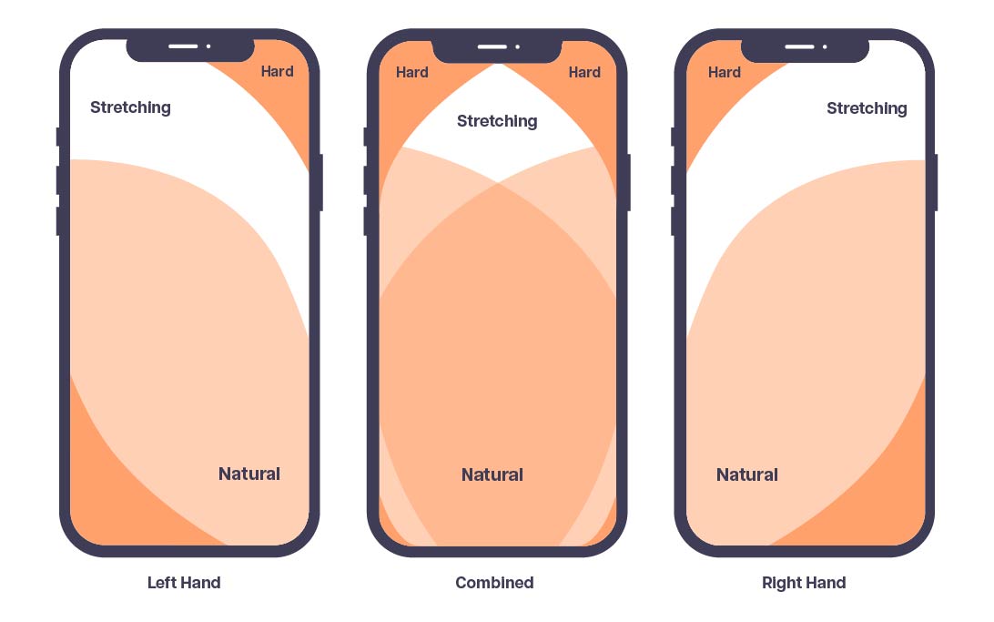
In addition to being a growing web trend, understanding how what the thumb rule and its zones to keep within can greatly reduce user frustration and increase participation on your website. Even though our thumbs are the shortest finger index on our hands, they are the go-to finger to navigate on mobile devices - 80% of Generation Zs and 67% of Millennials. So, the Thumb Rule leverages on the understanding that areas within the thumb natural zone will get more taps than areas in the stretching and thumb zones.
An example is iPhone’s decision to shift its Safari search bar from the top to bottom for easier thumb navigation.
How to design for mobiles and keep within the Thumb Zone?
If you are designing for a desktop-first website, make sure when moving onto mobile design, on top of tiling down your elements, to include considerations for the thumb zones and thumb navigation.
1. Present your header menu navigation on the page view
If you have an E-commerce website with multiple categories, there will come a need to scroll from the top bar’s hamburger menu, especially if you have many types of products. To reduce such hard-to-reach spaces, you can utilise metro styling and instead show your main categories on the landing page. In conjunction, having a mega menu which has large clickable space for each navigation item can help decrease error in mis-tapping.
2. View area VS Action area
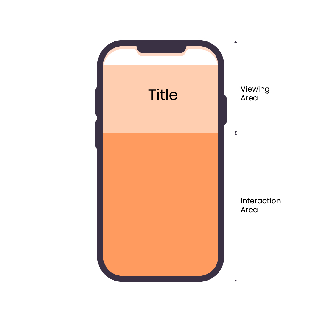
Traditionally, a desktop’s browser screen action area refers to the browser action bars, where you can switch to a new tab, shortcuts, etc, while the view area of a browser screen refers to the viewport, or the content area. Borrowing from this concept, your page menu and all additional critical buttons, for example add to cart buttons, live chat buttons, book an appointment or social sharing buttons - should be considered the action area, while the rest of your content (which may still have links inside as part of the content) is considered the view area. Unlike on a desktop where the whole screen is open play for navigation, on a smaller screen like a mobile device, there should be a conscious effort to divide the viewing area (top) and interaction area (bottom).
3. Single Sign-On (SSO)
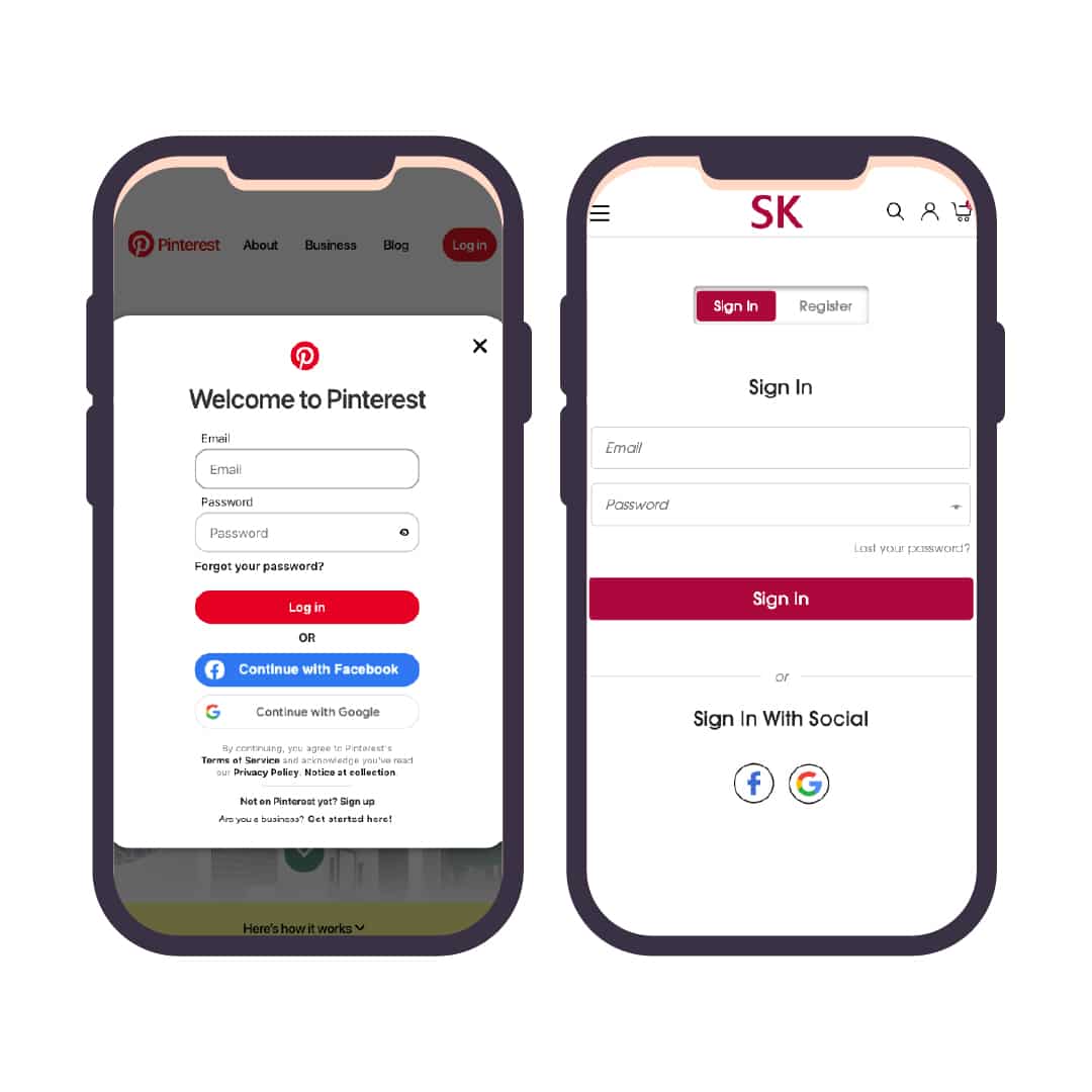
Reducing the number of clicks a user must engage with to get to the call-to-action or conversion page not only increases user engagement, but it can also help to greatly reduce unnecessary thumb-mobile movement.
For example, instead of signing in with 3 clicks – Entering name & email fields, typing user information and clicking on the login button, you can instead implement Single Sign-On (SSO) for pages that needs login capabilities. SSO is an authentication scheme which allows users to login with the use of either biometrics, social media accounts or existing independent software systems like Google. SSO can also reduce the need to sign up for accounts, encouraging users to create an account for your potential business benefits like email marketing and e-commerce strategies.
Conclusion
As you can see, having good thumb navigation is not just about bringing the areas users will click on the most to the bottom of the screen, but also understanding how you can reduce thumb/finger movement so that it can ultimately benefit your website visitors and your business.
Interested in finding out more?
Drop us a line — we’d be happy to join you on your web journey. For some interactive web design inspiration, check out our Fab Lab!
'%3e%3ccircle%20id='Ellipse_37'%20data-name='Ellipse%2037'%20cx='21'%20cy='21'%20r='21'%20transform='translate(0%200.276)'%20fill='%23f47655'/%3e%3cpath%20id='Icon_awesome-facebook-f'%20data-name='Icon%20awesome-facebook-f'%20d='M12.684,14.6,13.3,9.9H9.456V6.855c0-1.285.537-2.538,2.258-2.538H13.46v-4A18.261,18.261,0,0,0,10.36,0C7.2,0,5.127,2.25,5.127,6.323V9.9H1.609v4.7H5.127V25.958H9.456V14.6Z'%20transform='translate(13.679%208.32)'%20fill='%23fff'/%3e%3c/g%3e%3c/svg%3e)
'%3e%3ccircle%20id='Ellipse_37'%20data-name='Ellipse%2037'%20cx='21'%20cy='21'%20r='21'%20transform='translate(0%200.276)'%20fill='%233f536b'/%3e%3cpath%20id='Icon_awesome-facebook-f'%20data-name='Icon%20awesome-facebook-f'%20d='M12.684,14.6,13.3,9.9H9.456V6.855c0-1.285.537-2.538,2.258-2.538H13.46v-4A18.261,18.261,0,0,0,10.36,0C7.2,0,5.127,2.25,5.127,6.323V9.9H1.609v4.7H5.127V25.958H9.456V14.6Z'%20transform='translate(13.679%208.32)'%20fill='%23fff'/%3e%3c/g%3e%3c/svg%3e)
'%3e%3ccircle%20id='Ellipse_38'%20data-name='Ellipse%2038'%20cx='21'%20cy='21'%20r='21'%20transform='translate(-0.285%200.276)'%20fill='%23f47655'/%3e%3cpath%20id='Icon_awesome-twitter'%20data-name='Icon%20awesome-twitter'%20d='M20.289,7.958c.014.2.014.4.014.6A13.1,13.1,0,0,1,7.117,21.747,13.1,13.1,0,0,1,0,19.667a9.588,9.588,0,0,0,1.119.057,9.282,9.282,0,0,0,5.754-1.98A4.643,4.643,0,0,1,2.54,14.53a5.845,5.845,0,0,0,.875.072,4.9,4.9,0,0,0,1.22-.158A4.635,4.635,0,0,1,.918,9.9V9.838a4.668,4.668,0,0,0,2.095.588,4.642,4.642,0,0,1-1.435-6.2,13.174,13.174,0,0,0,9.556,4.85,5.232,5.232,0,0,1-.115-1.062,4.639,4.639,0,0,1,8.021-3.171,9.125,9.125,0,0,0,2.941-1.119,4.622,4.622,0,0,1-2.038,2.554,9.291,9.291,0,0,0,2.669-.717,9.963,9.963,0,0,1-2.324,2.4Z'%20transform='translate(9.51%209.042)'%20fill='%23fff'/%3e%3c/g%3e%3c/svg%3e)
'%3e%3ccircle%20id='Ellipse_38'%20data-name='Ellipse%2038'%20cx='21'%20cy='21'%20r='21'%20transform='translate(-0.285%200.276)'%20fill='%233f536b'/%3e%3cpath%20id='Icon_awesome-twitter'%20data-name='Icon%20awesome-twitter'%20d='M20.289,7.958c.014.2.014.4.014.6A13.1,13.1,0,0,1,7.117,21.747,13.1,13.1,0,0,1,0,19.667a9.588,9.588,0,0,0,1.119.057,9.282,9.282,0,0,0,5.754-1.98A4.643,4.643,0,0,1,2.54,14.53a5.845,5.845,0,0,0,.875.072,4.9,4.9,0,0,0,1.22-.158A4.635,4.635,0,0,1,.918,9.9V9.838a4.668,4.668,0,0,0,2.095.588,4.642,4.642,0,0,1-1.435-6.2,13.174,13.174,0,0,0,9.556,4.85,5.232,5.232,0,0,1-.115-1.062,4.639,4.639,0,0,1,8.021-3.171,9.125,9.125,0,0,0,2.941-1.119,4.622,4.622,0,0,1-2.038,2.554,9.291,9.291,0,0,0,2.669-.717,9.963,9.963,0,0,1-2.324,2.4Z'%20transform='translate(9.51%209.042)'%20fill='%23fff'/%3e%3c/g%3e%3c/svg%3e)
'%3e%3ccircle%20id='Ellipse_38'%20data-name='Ellipse%2038'%20cx='21'%20cy='21'%20r='21'%20transform='translate(-0.285%200.276)'%20fill='%23f47655'/%3e%3cpath%20id='Icon_awesome-linkedin-in'%20data-name='Icon%20awesome-linkedin-in'%20d='M4.527,20.223H.334V6.722H4.527ZM2.428,4.88A2.44,2.44,0,1,1,4.856,2.429,2.449,2.449,0,0,1,2.428,4.88Zm17.79,15.343H16.035V13.65c0-1.566-.032-3.575-2.18-3.575-2.18,0-2.514,1.7-2.514,3.462v6.685H7.153V6.722h4.021V8.563h.059A4.405,4.405,0,0,1,15.2,6.383c4.243,0,5.023,2.794,5.023,6.423v7.416Z'%20transform='translate(11.341%2010.163)'%20fill='%23fff'/%3e%3c/g%3e%3c/svg%3e)
'%3e%3ccircle%20id='Ellipse_38'%20data-name='Ellipse%2038'%20cx='21'%20cy='21'%20r='21'%20transform='translate(-0.285%200.276)'%20fill='%233f536b'/%3e%3cpath%20id='Icon_awesome-linkedin-in'%20data-name='Icon%20awesome-linkedin-in'%20d='M4.527,20.223H.334V6.722H4.527ZM2.428,4.88A2.44,2.44,0,1,1,4.856,2.429,2.449,2.449,0,0,1,2.428,4.88Zm17.79,15.343H16.035V13.65c0-1.566-.032-3.575-2.18-3.575-2.18,0-2.514,1.7-2.514,3.462v6.685H7.153V6.722h4.021V8.563h.059A4.405,4.405,0,0,1,15.2,6.383c4.243,0,5.023,2.794,5.023,6.423v7.416Z'%20transform='translate(11.341%2010.163)'%20fill='%23fff'/%3e%3c/g%3e%3c/svg%3e)