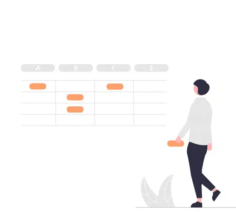
Designing and presenting tables on mobile devices comes with several challenges due to limited screen size and the need to maintain usability and readability. Let’s take a look at the key things to take note of when designing tables for mobiles.
Problems you might face when designing tables for mobile
1. Limited Screen Space
Mobile screens have significantly less space compared to desktop monitors, making it challenging to display complex tables with numerous columns and rows without overwhelming the user.
2. Readability and Clarity
Tables with a lot of information can be difficult to read and comprehend on small screens, especially for older users who might have eyesight issues, leading to potential usability issues and user frustration.
3. Responsive Design
Ensuring that tables are displayed effectively across various devices and screen sizes can be a challenge. Tables need to adapt and respond to different screen sizes while maintaining usability and readability.
How to fix table issues on mobile
Handling tables on mobile devices involves optimising the presentation and usability of tabular data on smaller screens to ensure a good user experience. Here are some tips for effectively handling tables on mobile to discuss with your web design agency in Singapore.
1. Prioritise primary information
Hiding of columns leaving only the key data or information on display is an easy and simple way of condensing the table without it being overwhelming. In addition, you can include a ‘view more’ button to expand the table or bring users to the other sections.
2. Use Icons
Icons can be used to replace simple headers and support text to shorten cell width. I.e., if you have a checklist table on your website, you can replace the ‘Done’ status with the tick icon instead.
3. Horizontal Scroll
Instead of vertical scrolls for tables, horizontal scrolls can display information better by not making it look cluttered, where users are able to scroll left and right to view all the content, reducing the need for adjusting to the vertical screen space.
Interested in finding out more?
Drop us a line — we’d be happy to advise you in further detail. For some interactive web design inspiration, check out our Fab Lab!
'%3e%3ccircle%20id='Ellipse_37'%20data-name='Ellipse%2037'%20cx='21'%20cy='21'%20r='21'%20transform='translate(0%200.276)'%20fill='%23f47655'/%3e%3cpath%20id='Icon_awesome-facebook-f'%20data-name='Icon%20awesome-facebook-f'%20d='M12.684,14.6,13.3,9.9H9.456V6.855c0-1.285.537-2.538,2.258-2.538H13.46v-4A18.261,18.261,0,0,0,10.36,0C7.2,0,5.127,2.25,5.127,6.323V9.9H1.609v4.7H5.127V25.958H9.456V14.6Z'%20transform='translate(13.679%208.32)'%20fill='%23fff'/%3e%3c/g%3e%3c/svg%3e)
'%3e%3ccircle%20id='Ellipse_37'%20data-name='Ellipse%2037'%20cx='21'%20cy='21'%20r='21'%20transform='translate(0%200.276)'%20fill='%233f536b'/%3e%3cpath%20id='Icon_awesome-facebook-f'%20data-name='Icon%20awesome-facebook-f'%20d='M12.684,14.6,13.3,9.9H9.456V6.855c0-1.285.537-2.538,2.258-2.538H13.46v-4A18.261,18.261,0,0,0,10.36,0C7.2,0,5.127,2.25,5.127,6.323V9.9H1.609v4.7H5.127V25.958H9.456V14.6Z'%20transform='translate(13.679%208.32)'%20fill='%23fff'/%3e%3c/g%3e%3c/svg%3e)
'%3e%3ccircle%20id='Ellipse_38'%20data-name='Ellipse%2038'%20cx='21'%20cy='21'%20r='21'%20transform='translate(-0.285%200.276)'%20fill='%23f47655'/%3e%3cpath%20id='Icon_awesome-twitter'%20data-name='Icon%20awesome-twitter'%20d='M20.289,7.958c.014.2.014.4.014.6A13.1,13.1,0,0,1,7.117,21.747,13.1,13.1,0,0,1,0,19.667a9.588,9.588,0,0,0,1.119.057,9.282,9.282,0,0,0,5.754-1.98A4.643,4.643,0,0,1,2.54,14.53a5.845,5.845,0,0,0,.875.072,4.9,4.9,0,0,0,1.22-.158A4.635,4.635,0,0,1,.918,9.9V9.838a4.668,4.668,0,0,0,2.095.588,4.642,4.642,0,0,1-1.435-6.2,13.174,13.174,0,0,0,9.556,4.85,5.232,5.232,0,0,1-.115-1.062,4.639,4.639,0,0,1,8.021-3.171,9.125,9.125,0,0,0,2.941-1.119,4.622,4.622,0,0,1-2.038,2.554,9.291,9.291,0,0,0,2.669-.717,9.963,9.963,0,0,1-2.324,2.4Z'%20transform='translate(9.51%209.042)'%20fill='%23fff'/%3e%3c/g%3e%3c/svg%3e)
'%3e%3ccircle%20id='Ellipse_38'%20data-name='Ellipse%2038'%20cx='21'%20cy='21'%20r='21'%20transform='translate(-0.285%200.276)'%20fill='%233f536b'/%3e%3cpath%20id='Icon_awesome-twitter'%20data-name='Icon%20awesome-twitter'%20d='M20.289,7.958c.014.2.014.4.014.6A13.1,13.1,0,0,1,7.117,21.747,13.1,13.1,0,0,1,0,19.667a9.588,9.588,0,0,0,1.119.057,9.282,9.282,0,0,0,5.754-1.98A4.643,4.643,0,0,1,2.54,14.53a5.845,5.845,0,0,0,.875.072,4.9,4.9,0,0,0,1.22-.158A4.635,4.635,0,0,1,.918,9.9V9.838a4.668,4.668,0,0,0,2.095.588,4.642,4.642,0,0,1-1.435-6.2,13.174,13.174,0,0,0,9.556,4.85,5.232,5.232,0,0,1-.115-1.062,4.639,4.639,0,0,1,8.021-3.171,9.125,9.125,0,0,0,2.941-1.119,4.622,4.622,0,0,1-2.038,2.554,9.291,9.291,0,0,0,2.669-.717,9.963,9.963,0,0,1-2.324,2.4Z'%20transform='translate(9.51%209.042)'%20fill='%23fff'/%3e%3c/g%3e%3c/svg%3e)
'%3e%3ccircle%20id='Ellipse_38'%20data-name='Ellipse%2038'%20cx='21'%20cy='21'%20r='21'%20transform='translate(-0.285%200.276)'%20fill='%23f47655'/%3e%3cpath%20id='Icon_awesome-linkedin-in'%20data-name='Icon%20awesome-linkedin-in'%20d='M4.527,20.223H.334V6.722H4.527ZM2.428,4.88A2.44,2.44,0,1,1,4.856,2.429,2.449,2.449,0,0,1,2.428,4.88Zm17.79,15.343H16.035V13.65c0-1.566-.032-3.575-2.18-3.575-2.18,0-2.514,1.7-2.514,3.462v6.685H7.153V6.722h4.021V8.563h.059A4.405,4.405,0,0,1,15.2,6.383c4.243,0,5.023,2.794,5.023,6.423v7.416Z'%20transform='translate(11.341%2010.163)'%20fill='%23fff'/%3e%3c/g%3e%3c/svg%3e)
'%3e%3ccircle%20id='Ellipse_38'%20data-name='Ellipse%2038'%20cx='21'%20cy='21'%20r='21'%20transform='translate(-0.285%200.276)'%20fill='%233f536b'/%3e%3cpath%20id='Icon_awesome-linkedin-in'%20data-name='Icon%20awesome-linkedin-in'%20d='M4.527,20.223H.334V6.722H4.527ZM2.428,4.88A2.44,2.44,0,1,1,4.856,2.429,2.449,2.449,0,0,1,2.428,4.88Zm17.79,15.343H16.035V13.65c0-1.566-.032-3.575-2.18-3.575-2.18,0-2.514,1.7-2.514,3.462v6.685H7.153V6.722h4.021V8.563h.059A4.405,4.405,0,0,1,15.2,6.383c4.243,0,5.023,2.794,5.023,6.423v7.416Z'%20transform='translate(11.341%2010.163)'%20fill='%23fff'/%3e%3c/g%3e%3c/svg%3e)