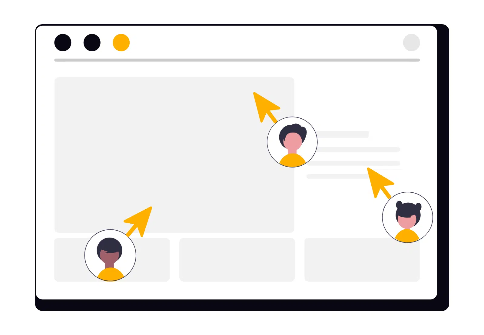
Modern websites exist in a fast-moving digital environment where attention is scarce and competition is constant. Users no longer browse websites patiently, reading every paragraph and exploring every page. Instead, they scan quickly, evaluate instantly, and decide within seconds whether a website deserves their attention.
This shift in behaviour has transformed how digital experiences must be designed. Visitors arrive with a purpose — whether it is to find information, evaluate a service, or solve a specific problem. If they cannot quickly understand what your business offers and why it matters to them, they will simply move on.
High-performing websites acknowledge this reality. They are not designed around how businesses want to present information but around how users actually process it. Every element — from layout to messaging to visual hierarchy — is intentionally structured to communicate value immediately.
Designing digital experiences that convert in seconds is not about simplifying ideas to the point of losing depth. It is about presenting information in a way that users can understand instantly and act upon confidently.
The Business Case: What You Stand to Lose
When a website fails to communicate value quickly, the consequences extend beyond aesthetics. Poor clarity and slow comprehension can directly impact business performance.
Common outcomes include:
Higher bounce rates when visitors cannot immediately understand what the company offers
Lower conversion rates when users hesitate due to unclear messaging
Reduced engagement when layouts are confusing or visually overwhelming
Missed revenue opportunities as distracted users abandon the experience
Weakened brand credibility when the digital experience feels outdated or unstructured
In today’s competitive digital marketplace, the ability to communicate quickly is not simply a design preference — it is a strategic advantage. Websites that prioritise clarity capture attention and guide users toward action. Those that do not risk losing visitors before the conversation even begins.
Designing for Immediate Impact
Designing for instant understanding requires a deliberate approach. It involves structuring content, visuals, and interactions so users can grasp meaning without effort.
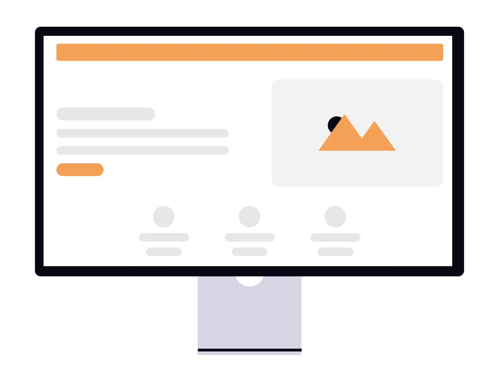
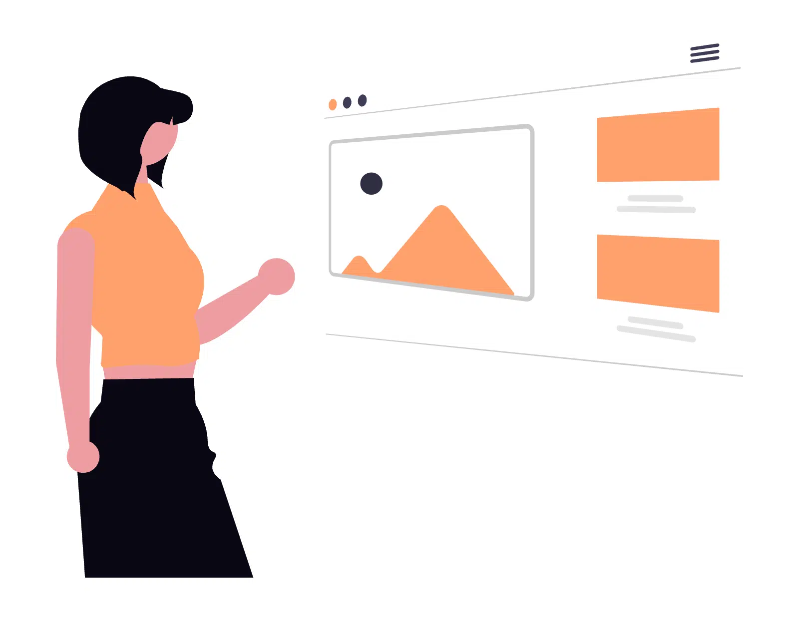
1. Establish Clear Visual Hierarchy
Visual hierarchy determines how users process information on a page. It directs attention and helps visitors understand what matters most.
Strong hierarchy uses typography size, spacing, colour contrast, and layout positioning to guide the eye naturally. Headlines should communicate the primary value proposition clearly and confidently. Subheadings provide supporting context, while body text fills in the details for users who wish to explore further.
Without hierarchy, users must search for meaning themselves. With it, the page effectively explains itself.
A well-structured hierarchy ensures that even users who only skim the page can understand the key message.
2. Lead With Outcomes, Not Features
Businesses often make the mistake of focusing heavily on features. While features describe what a product or service does, they do not necessarily explain why it matters.
Users care about outcomes.
Instead of presenting technical specifications or internal capabilities first, focus on the transformation your service provides. Communicate the result users can expect — whether it is improved efficiency, increased revenue, enhanced performance, or simplified processes.
Outcome-driven messaging connects immediately because it aligns with user motivations.
Once users understand the value, they are far more likely to continue exploring the details.
3. Simplify Above-the-Fold Content
The section of the website visible before scrolling — often called “above the fold” — is the most critical area of the page.
Within this space, your website should answer three essential questions:
What does your company do?
Who is the service designed for?
What action should the visitor take next?
When these answers are immediately clear, users feel oriented and confident. They know they are in the right place and understand how to proceed.
Cluttered above-the-fold sections often attempt to communicate too much information at once. Instead of improving clarity, they overwhelm visitors and dilute the primary message.
Simplicity in this area creates focus.
4. Reduce Cognitive Load
Cognitive load refers to the amount of mental effort required to process information. Websites that demand too much effort from users risk losing attention quickly.
Reducing cognitive load involves eliminating unnecessary elements, simplifying navigation, and structuring information logically.
Short paragraphs, meaningful headings, and visual separation between sections allow users to scan content easily.
The goal is not to remove valuable information but to present it in a way that feels effortless to navigate.
5. Guide Users Toward Clear Actions
Every page should guide visitors toward a logical next step. Whether that step is contacting the company, requesting a demo, or learning more about services, the action should be clear and visually distinct.
Calls-to-action (CTAs) should stand out through contrast and placement. More importantly, they should communicate the value of taking action.
For example, a CTA such as “Get Started” communicates movement, while “Submit” feels passive and unclear.
Effective CTAs reinforce the momentum created by strong messaging and intuitive design.
Speed of Understanding Drives Results
In digital environments, speed of understanding is often more important than the volume of information presented.
When users can quickly grasp the purpose of a website and the benefits it offers, they feel confident moving forward. That confidence leads to deeper engagement, longer sessions, and ultimately stronger conversion rates.
Conversely, when visitors must work to understand a website’s value, hesitation appears. Hesitation leads to abandonment.
Clarity accelerates decision-making.
Design for Clarity, Not Complexity
Complex websites often attempt to impress through visual effects or dense information. However, complexity rarely improves performance. In most cases, it creates barriers between the user and the message.
Effective digital experiences remove those barriers.
By prioritising clear hierarchy, outcome-driven messaging, focused above-the-fold content, and intuitive actions, websites can communicate value instantly and guide users toward meaningful engagement.
Conversion does not begin with persuasion.
It begins with understanding.
When users understand your value within seconds, they are far more likely to stay, explore, and act.