Most users today don’t read websites; they skim. In a world of short attention spans and endless content, your website has just a few seconds to communicate its value. As such, designing for users who don’t read isn’t about dumbing down content; it’s about designing smarter.
The Business Case: What You Stand to Lose
Designing as if users read every word comes at a real cost. When sites aren’t built for scanning, the result is:
- Higher bounce rates when value isn’t immediately clear
- Lower conversion rates from buried messaging or unclear actions
- Weakened customer satisfaction from frustrating or outdated experiences
In an attention-scarce digital landscape, clarity, speed, and visual communication are the difference between websites that convert and those that get ignored.
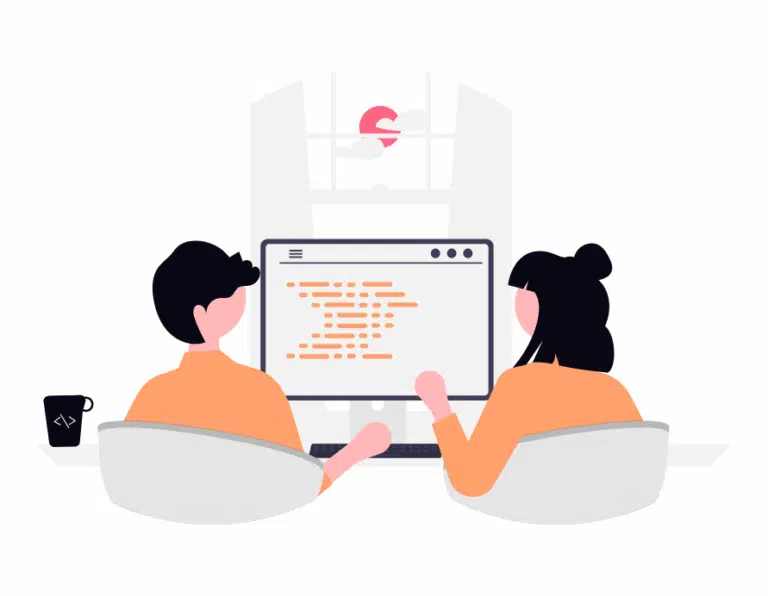
Designing for Real Users
1. Utilise Visual Hierarchy
When users don’t read, your layout becomes the storyteller. Strong visual hierarchy guides attention naturally using size, spacing, contrast, and placement, letting users understand your site intuitively.
2. Only Include the Essentials
When users skim instead of read, every extra word becomes friction. Strip interfaces down to what users actually need to move forward. Prioritise critical information and remove redundant explanations. A focused interface helps users understand faster, decide quicker, and act with confidence
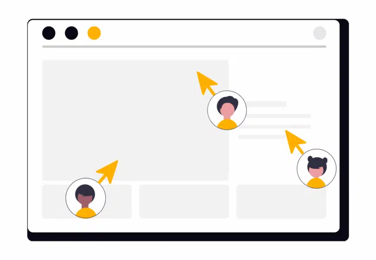
3. Show, Don’t Tell
Visual elements communicate faster than paragraphs ever will. Icons, images, and illustrations can instantly convey meaning, emotion, and intent. When possible, let visuals do the talking; text should support, not lead.
Design for Scanning, Not Reading
By embracing real browsing habits and prioritizing clarity, hierarchy, and visuals, your website projects become faster to understand and send the user experience over the moon.
'%3e%3ccircle%20id='Ellipse_37'%20data-name='Ellipse%2037'%20cx='21'%20cy='21'%20r='21'%20transform='translate(0%200.276)'%20fill='%23f47655'/%3e%3cpath%20id='Icon_awesome-facebook-f'%20data-name='Icon%20awesome-facebook-f'%20d='M12.684,14.6,13.3,9.9H9.456V6.855c0-1.285.537-2.538,2.258-2.538H13.46v-4A18.261,18.261,0,0,0,10.36,0C7.2,0,5.127,2.25,5.127,6.323V9.9H1.609v4.7H5.127V25.958H9.456V14.6Z'%20transform='translate(13.679%208.32)'%20fill='%23fff'/%3e%3c/g%3e%3c/svg%3e)
'%3e%3ccircle%20id='Ellipse_38'%20data-name='Ellipse%2038'%20cx='21'%20cy='21'%20r='21'%20transform='translate(-0.285%200.276)'%20fill='%23f47655'/%3e%3cpath%20id='Icon_awesome-twitter'%20data-name='Icon%20awesome-twitter'%20d='M20.289,7.958c.014.2.014.4.014.6A13.1,13.1,0,0,1,7.117,21.747,13.1,13.1,0,0,1,0,19.667a9.588,9.588,0,0,0,1.119.057,9.282,9.282,0,0,0,5.754-1.98A4.643,4.643,0,0,1,2.54,14.53a5.845,5.845,0,0,0,.875.072,4.9,4.9,0,0,0,1.22-.158A4.635,4.635,0,0,1,.918,9.9V9.838a4.668,4.668,0,0,0,2.095.588,4.642,4.642,0,0,1-1.435-6.2,13.174,13.174,0,0,0,9.556,4.85,5.232,5.232,0,0,1-.115-1.062,4.639,4.639,0,0,1,8.021-3.171,9.125,9.125,0,0,0,2.941-1.119,4.622,4.622,0,0,1-2.038,2.554,9.291,9.291,0,0,0,2.669-.717,9.963,9.963,0,0,1-2.324,2.4Z'%20transform='translate(9.51%209.042)'%20fill='%23fff'/%3e%3c/g%3e%3c/svg%3e)
'%3e%3ccircle%20id='Ellipse_38'%20data-name='Ellipse%2038'%20cx='21'%20cy='21'%20r='21'%20transform='translate(-0.285%200.276)'%20fill='%23f47655'/%3e%3cpath%20id='Icon_awesome-linkedin-in'%20data-name='Icon%20awesome-linkedin-in'%20d='M4.527,20.223H.334V6.722H4.527ZM2.428,4.88A2.44,2.44,0,1,1,4.856,2.429,2.449,2.449,0,0,1,2.428,4.88Zm17.79,15.343H16.035V13.65c0-1.566-.032-3.575-2.18-3.575-2.18,0-2.514,1.7-2.514,3.462v6.685H7.153V6.722h4.021V8.563h.059A4.405,4.405,0,0,1,15.2,6.383c4.243,0,5.023,2.794,5.023,6.423v7.416Z'%20transform='translate(11.341%2010.163)'%20fill='%23fff'/%3e%3c/g%3e%3c/svg%3e)