Amidst the evolution of web design, grid systems have remained a cornerstone, providing structure and consistency while allowing for flexibility. Understanding the role of grid systems in modern web design is essential for designers and developers seeking to create aesthetically pleasing, highly functional websites.
What Is a Grid System?
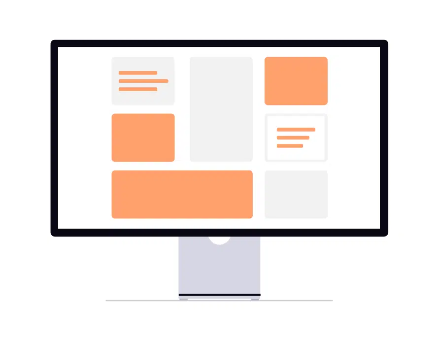
A grid system is a framework of intersecting horizontal and vertical lines that helps designers arrange content on a page. At its core, it divides a layout into:
- Columns – vertical divisions for aligning content
- Rows – horizontal sections for flow and spacing
- Gutters – spaces between columns to maintain balance
Used in both print and digital design, grids ensure alignment, proportion, and visual balance across a layout.
1. Consistency and Alignment
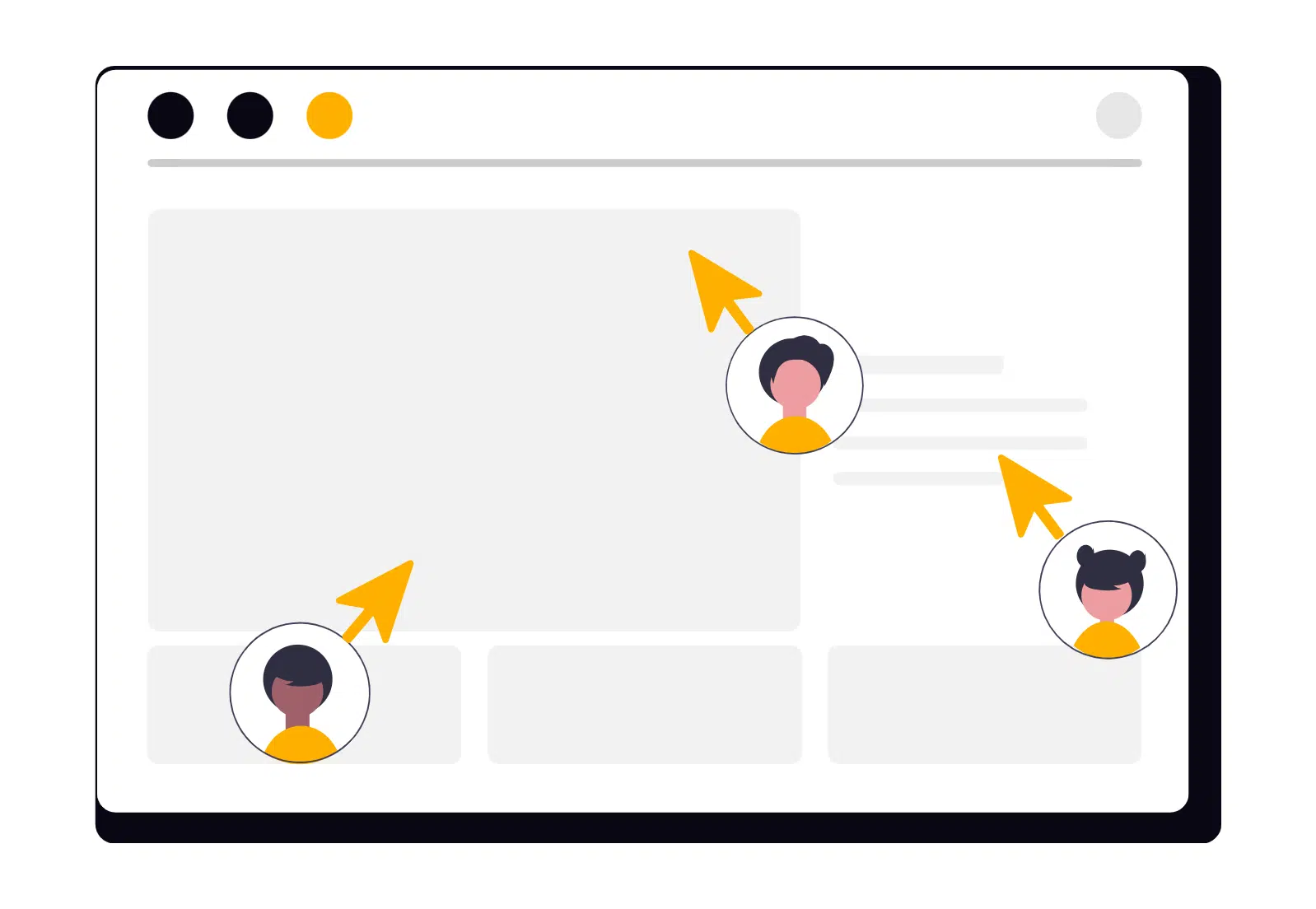
One of the most important benefits of using a grid is the consistency it brings. By aligning elements to a shared framework, designers ensure that spacing, margins, and proportions remain uniform throughout a website. This makes the site more visually appealing while enhancing usability, as users can intuitively navigate and predict content placement.
2. Responsive Design Made Easier
Modern web design must account for countless device sizes and resolutions. Grid systems simplify responsive design by providing a flexible structure that can adapt to different screen widths. Whether it’s a smartphone, tablet, or desktop, grids allow designers to rearrange and resize content without compromising readability or aesthetics.
3. Faster Design and Development Workflow
Grids streamline collaboration between designers and developers. A well-defined grid system acts as a blueprint for the layout, reducing ambiguity and speeding up the design and development process. It also makes scaling and updating the website easier since new content can be placed within the established structure.
4. Enhancing Visual Hierarchy
Grids help designers control the visual hierarchy of a page. By defining where elements appear and how they relate to each other, grids help establish:
- Primary and secondary content areas
- Strategic placement of headlines, images, and CTAs
- Sufficient whitespace to prevent clutter
- Clear, intuitive pathways for the user’s eye
This makes the website easier to scan, more engaging, and more effective at communicating its message.
Conclusion
Grid systems are far more than a design convention, they are a foundational tool that balances structure with creativity.
By providing consistency, simplifying responsive design, speeding up workflows, and enhancing visual hierarchy, grids help designers create websites that are both beautiful and functional. In an era where user experience is paramount, mastering grid systems is essential for any modern web designer.


