
Mobile-First Design: Why It Matters More Than Ever
In the past two decades, the way people access the internet has undergone a dramatic transformation. The 2007 launch of the iPhone didn’t just revolutionize mobile technology—it reshaped the entire internet.
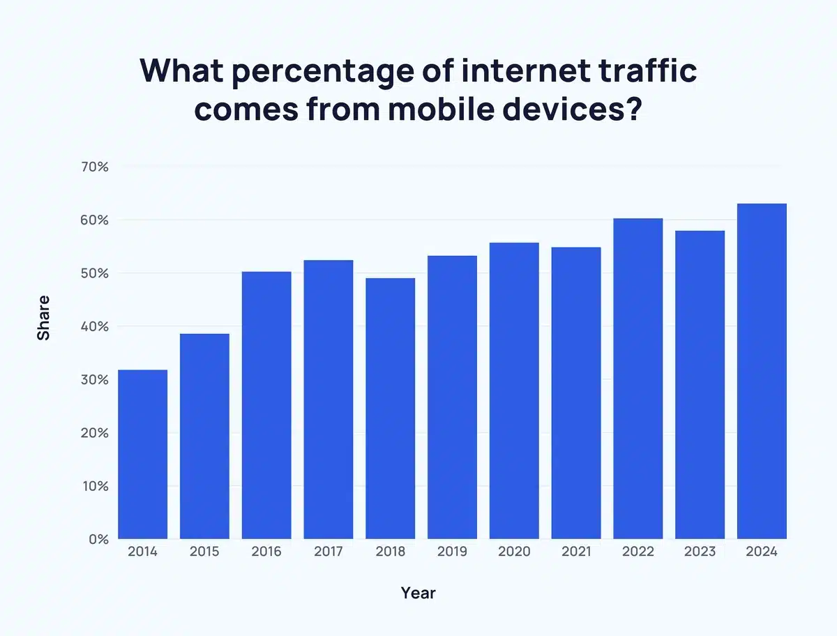
Today, more than 60% of global internet traffic comes from mobile devices, and in some regions, mobile usage exceeds 90%. This isn’t a passing trend—it’s a foundational shift in digital behavior. People are now more likely to browse websites, make purchases, and interact with content on their phones than on desktop computers.
If your website is still built with a desktop-first mindset, it’s time to rethink your approach.
Why Mobile-First Design Is Essential Today
A mobile-first design means starting your website layout with the smallest screen in mind and scaling up from there. Unlike the outdated desktop-first approach—which often leads to cluttered or broken mobile experiences—mobile-first ensures your site works where users are actually browsing.
Here’s why it matters:
- User Behavior: Most people now access the web via smartphones or tablets.
- SEO: Google uses mobile-first indexing, so your mobile site plays a larger role in your search rankings than your desktop version.
- Performance: Mobile-first designs are typically faster and leaner, improving load times and user retention.
- Accessibility: Clean, simple layouts improve usability for all users—not just those on mobile.
1. Prioritize Content Ruthlessly
Small screens force focus—and that’s a good thing.
Ask yourself:
- What’s the primary goal of this page?
- What does the user need to see or do immediately?
Structure your content with clear hierarchy:
- Primary content at the top
- Supporting details below
- Calls-to-action (CTAs) placed prominently and used sparingly
Clarity improves the experience not just for mobile users—but for everyone.
2. Design for Fingers, Not Cursors
Mobile users don’t click—they tap and swipe.
To ensure a smooth, touch-friendly experience:
- Make buttons at least 44x44px
- Keep tappable elements well spaced
- Place important controls within thumb reach
- Avoid hover effects—they don’t work on touch devices
- Keep forms short and use mobile-friendly input types (e.g., tel for phone numbers)
3. Make Media Mobile-Friendly
Speed is everything on mobile—especially on slower networks.
Follow these best practices:
- Use modern, compressed formats like WebP
- Lazy-load off-screen images and videos
- Avoid autoplay unless muted and essential
- Optimize all media to balance quality and performance
These steps reduce bounce rates and boost SEO rankings.
Final Thoughts
Mobile-first design isn’t about limitations—it’s about creating a better, faster, and more user-focused experience. By prioritizing essential content, designing for touch, and optimizing performance, you’re not just adapting to mobile—you’re future-proofing your entire digital presence.


