Colour plays a fundamental role in shaping user perception and emotions. In web design, the right choice of colours can influence user behaviour, build trust, and guide users seamlessly through a site. By applying colour psychology principles, designers can craft visually appealing and impactful experiences, fostering visual harmony.
Why Colour Matters in Web Design?
1. Sets the Tone and Mood
Colours evoke emotions and create a specific atmosphere. For example:
- Blue conveys trust, reliability, and calmness, often used by tech and financial brands in their web designs to establish credibility.
- Red represents passion, urgency, or excitement, ideal for promotions or calls to action that drive user behaviour in web designs.
- Green is associated with growth, health, and sustainability, making it perfect for eco-conscious brands that value visual harmony in their design.
2. Enhances Brand Identity
Consistent colour usage aligned with your brand strengthens recognition and trust. Iconic examples include Coca-Cola’s red and Spotify’s green—strategic choices based on colour psychology.
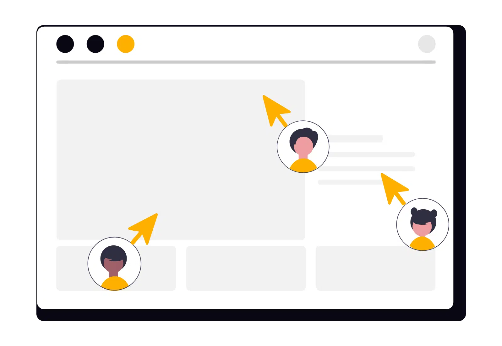
3. Guides User Behavior
Colours influence decisions and serve as a guide in web design. Contrasting hues, like a bright green “Buy Now” button on a neutral background, naturally draw attention to key actions.
4. Improves Readability and Usability
The right colour combinations ensure readability, reduce bounce rates and enhance user satisfaction. These are essential elements in achieving visual harmony for an effective web design.
How to Use Color Effectively in Web Design
1. Understand Your Audience
Different cultures and demographics interpret colours differently. For example, white symbolizes purity in Western cultures but mourning in some Eastern traditions. Researching your target audience ensures your colour choices align with their expectations and foster meaningful user behaviour.
2. Create a Balanced Palette
A cohesive colour palette enhances visual harmony and overall aesthetics.
- Primary Colours for branding and key elements.
- Secondary Colours to complement the primary tones.
- Neutral Colours (like black, gray, or white) for backgrounds and text to maintain balance in your web design.
3. Use Contrast to Highlight Key Elements
High contrast focuses attention. Bright buttons on muted backgrounds guide user behaviour effectively.
4. Leverage Tools for Consistency
Tools like Adobe Color or Coolors help generate harmonious palettes. Accessibility tools like Contrast Checker ensure inclusivity and maintain visual harmony.
Common Mistakes to Avoid
- Overloading with too many colours creates confusion and disrupts visual harmony.
- Ignoring accessibility alienates colourblind users and affects user behaviour.
- Following trends blindly may dilute brand identity.
Examples of Strategic Color Use in Web Design
- E-Commerce: Warm tones like red encourage urgency and action.
- Tech Brands: Blues convey trust and professionalism.
- Health and Wellness: Greens and pastels evoke calmness and rejuvenation.
Conclusion
Colour is a powerful tool that communicates your brand’s message, influences user behaviour, and enhances the overall experience. Thoughtful use of colour psychology creates captivating web designs that convert and maintain visual harmony.