In the realm of website design, buttons are more than mere functional elements—they are pivotal in guiding user behaviour, enhancing user experience, and reinforcing brand identity. Understanding the psychological principles behind button design can significantly impact engagement and conversion rates.
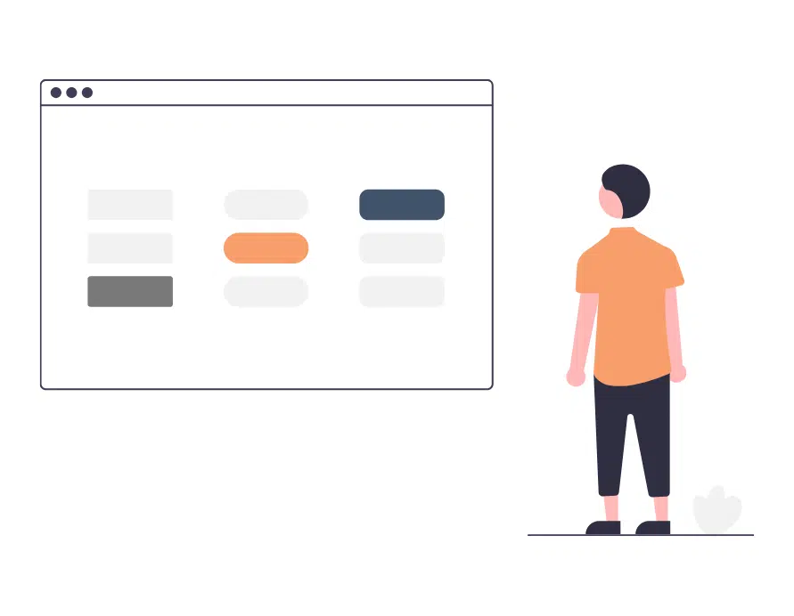
Shape Matters
The shape of a button subtly communicates its purpose and influences user interaction. Rounded buttons often convey friendliness and approachability, making them inviting to click. In contrast, square or rectangular buttons can suggest stability and professionalism. Aligning button shapes with your brand identity ensures consistency and fosters user trust.


Colour Communicates
Colours evoke emotions and can drive user actions. For instance:
– Red can create a sense of urgency, prompting immediate responses
– Blue often conveys trust and reliability
– Green is associated with success and progression.
Choosing button colours that contrast with the background enhances visibility and draws attention. It’s essential to select colours that align with your brand identity and resonate with your target audience.
Icons Improve Clarity and Cleanliness
Icons can significantly improve the effectiveness of button design when used correctly. Adding familiar, universal icons—such as an edit icon or download symbol—can visually reinforce the button’s purpose and reduce cognitive load. When paired with text, they add clarity; when used alone, they offer a minimal, modern aesthetic. Just be sure to use widely understood icons to avoid confusing users or compromising accessibility. Some common icons are:
- Pen: Very commonly used for edit functions
- Heart: Popular in e-commerce websites for adding to wishlist
- Bin: As straightforward as it is, it tends to translate to delete
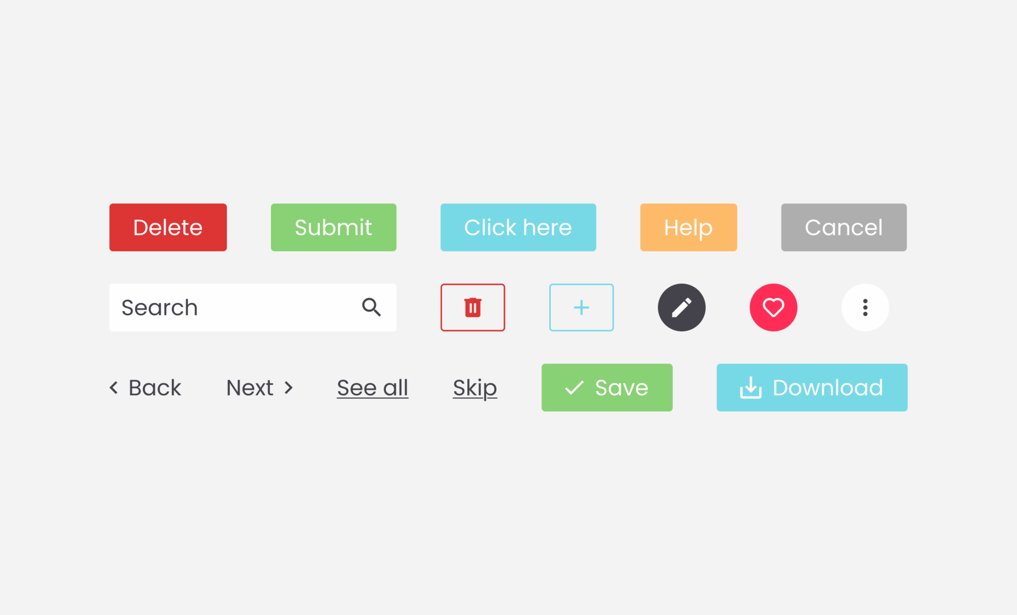
Text Drives Action
The wording on a button, or call-to-action (CTA), plays a crucial role in influencing clicks. Clear, concise, and action-oriented text like “Get Started” or “Download Now” sets clear expectations and motivates users. Avoid vague phrases; instead, use specific language that communicates the benefit or action, reinforcing the user’s decision to engage.
Integrating Design Elements for Optimal Engagement
Effective button design is a harmonious blend of shape, colour, and text. Thoughtfully integrating these elements into your brand guide creates intuitive pathways that guide your target audience toward desired actions. This enhances the overall user experience and supports SEO efforts by improving engagement metrics and reducing bounce rates.
Incorporating psychological insights into button design ensures that your website looks appealing and functions effectively, driving user interaction and achieving business objectives.
Want to customise your buttons?
Drop us a line — we’d be happy to help you improve those clicking rates. For some interactive web design inspiration, check out our Fab Lab!


